Crafting TheBando'sOnline Experience
Overview
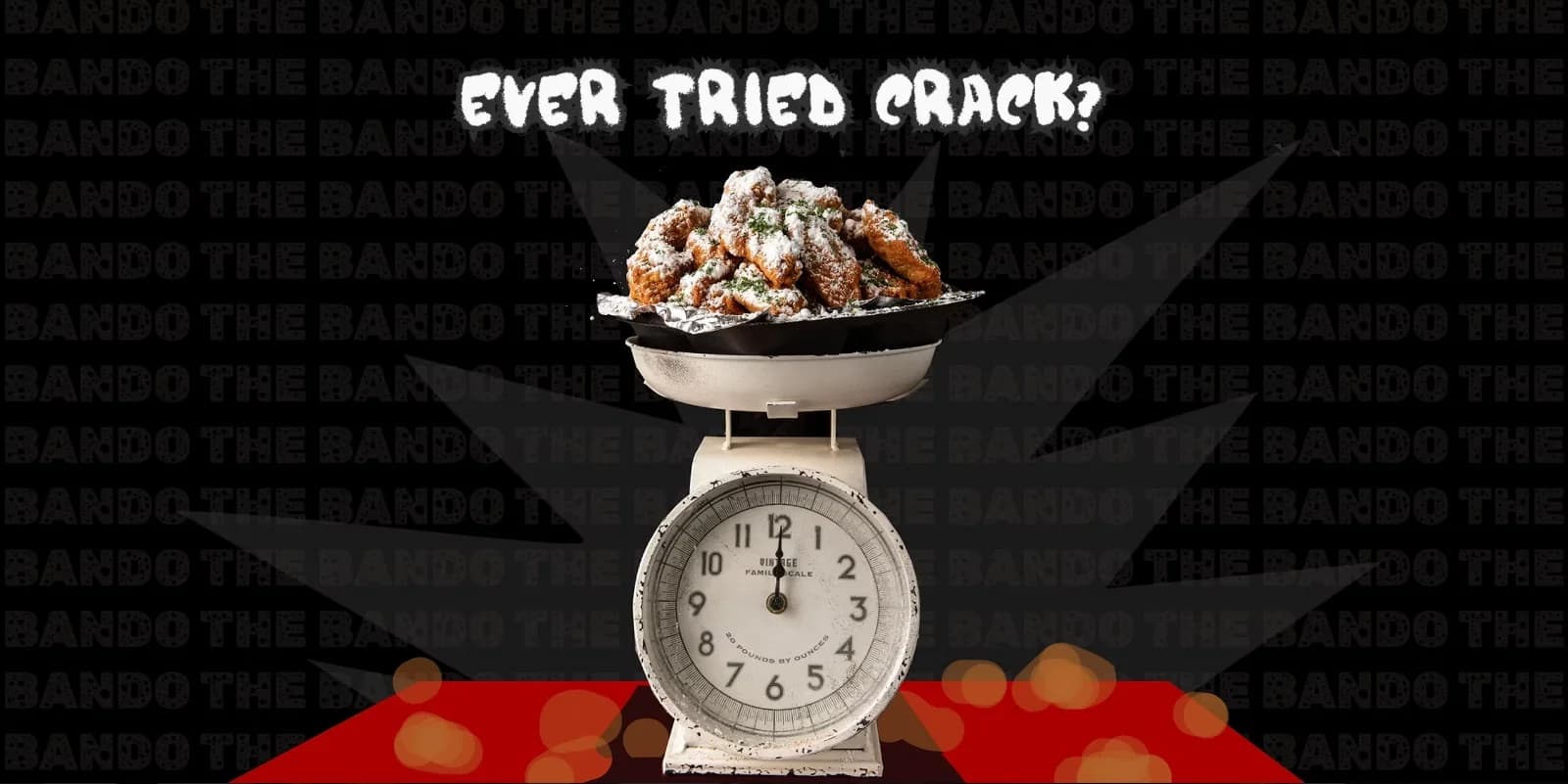
A digital redesign project for The Bando, a bold Black history museum and fried chicken restaurant in West Atlanta, bringing their unapologetic brand energy into an online experience.
The Challenge
The Bando's identity was powerful in person, but muted online. The site processed orders, but failed to capture the culture or keep people coming back.
Competitor Analysis
To define The Bando's digital direction, we studied two Atlanta brands known for loud, fast-selling experiences. But was that enough?
Slutty Vegan | URBAN WINGS | THE BANDO | |
|---|---|---|---|
| Speed & Conversion | |||
| Visual Boldness | × | ||
| Brand Voice | × | × | |
| Cultural Identity | × | × | |
| Community Feel | × | × | |
| Memorability | × | × |
Speed and usability are table stakes. Culture and personality are what make brands memorable.
DESIGN SYSTEM
Color and typography are fully defined and ready to scale.
grey - 100
#F9F9F9
grey - 200
#2F2F2F
grey - 300
#000000
red
#C90000
orange
#A84000
yellow
#FFD600
Main Typography - Pearl Jean
BOLD TYPE THAT SPEAKS BEFORE YOU READ.
Body Typography - Chelsea Market
Bold type that speaks before you read.
Accent Typography - Marceloup
BOLD TYPE THAT SPEAKS BEFORE YOU READ.
APPROACH
Design Language
Hand-drawn type with bold, playful visuals
Expressive style balanced with clear readability
UX & Functionality
Ordering flow refined to remove friction
Mobile-first design across all touchpoints
Experience Front to Back
A digital space that reflects the physical brand
Built to encourage connection and loyalty
Backend & Marketing Integration
SMS marketing and smart order controls
Clear flow from cart to confirmation
RESULT
60%
Within three months of launch, The Bando's website reduced bounce rate by 60%, turning curiosity into orders and repeat visits. The digital experience finally matched the bold, unapologetically Atlanta energy of the restaurant itself.
In their words
ROV understood what we're about, the food and the history, and built a site that finally moves like we do. Online orders went from a trickle to a flood, and people actually stay to read our story now.
Frequently asked
A full website redesign for The Bando, a Black history museum and fried-chicken restaurant in Atlanta, rebuilding the brand experience and the online ordering flow into one cohesive identity.
The redesigned site cut bounce rate by 60%, turning curiosity into orders and repeat visits, and drove a dramatic increase in online ordering.
It blends two identities, a museum and a restaurant, into a single, unapologetically Atlanta digital experience that reflects the brand's bold personality.
Project led by Ayush Basu, Founder & Creative Director at Range of View Studios.