
ROV Studios · Brand Identity · Atlanta Restaurants
TheBando: Designing a Brand for a Museum and a Restaurant at Once
TheBando is two things at once, a Black history museum and a fried chicken restaurant on Atlanta's Westside. Both are real. Both matter. This is the story of how ROV honored that dual identity through design, so the culture and the food could finally share the same page without either one getting lost.
A museum and a restaurant, in one building
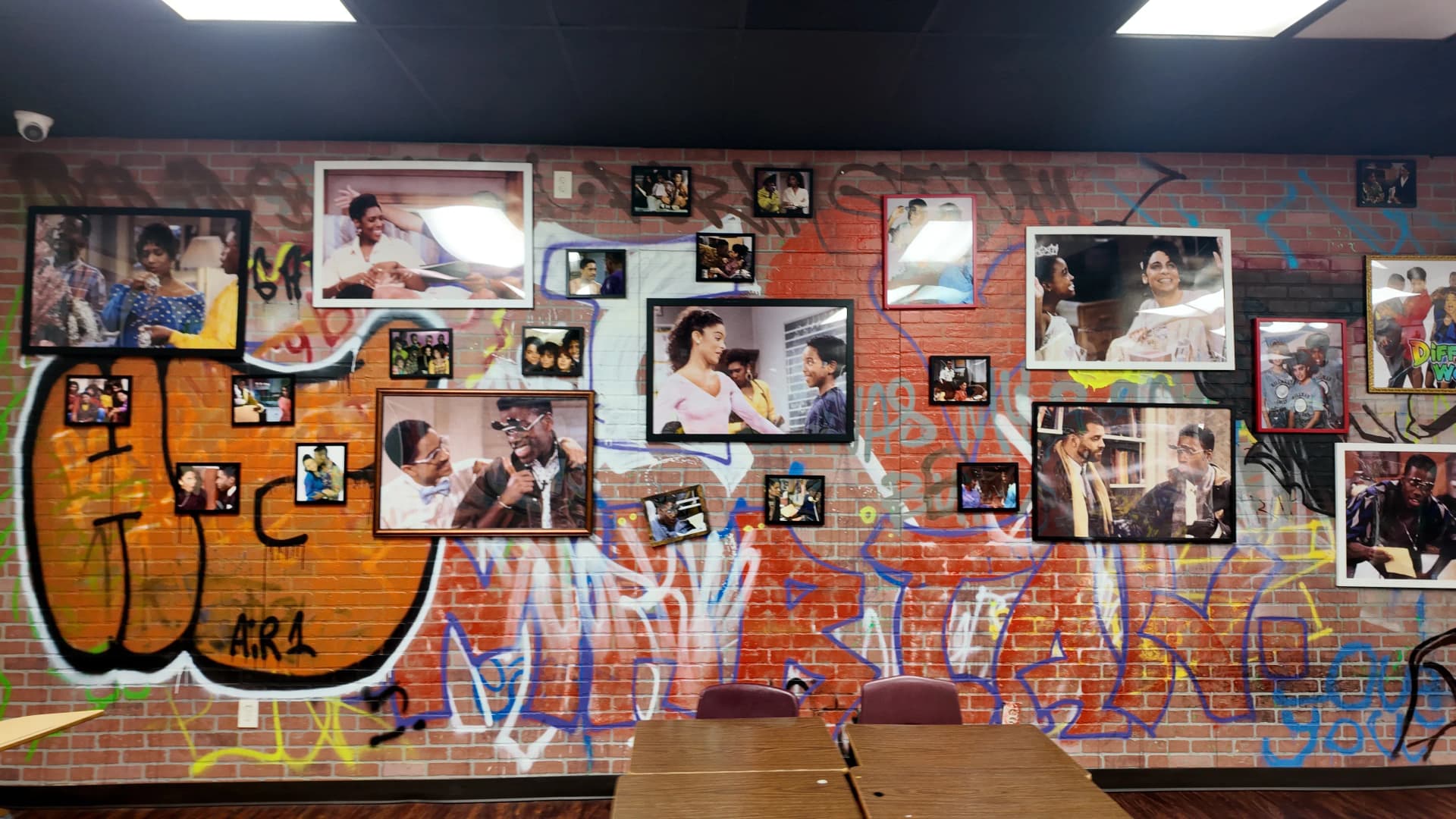
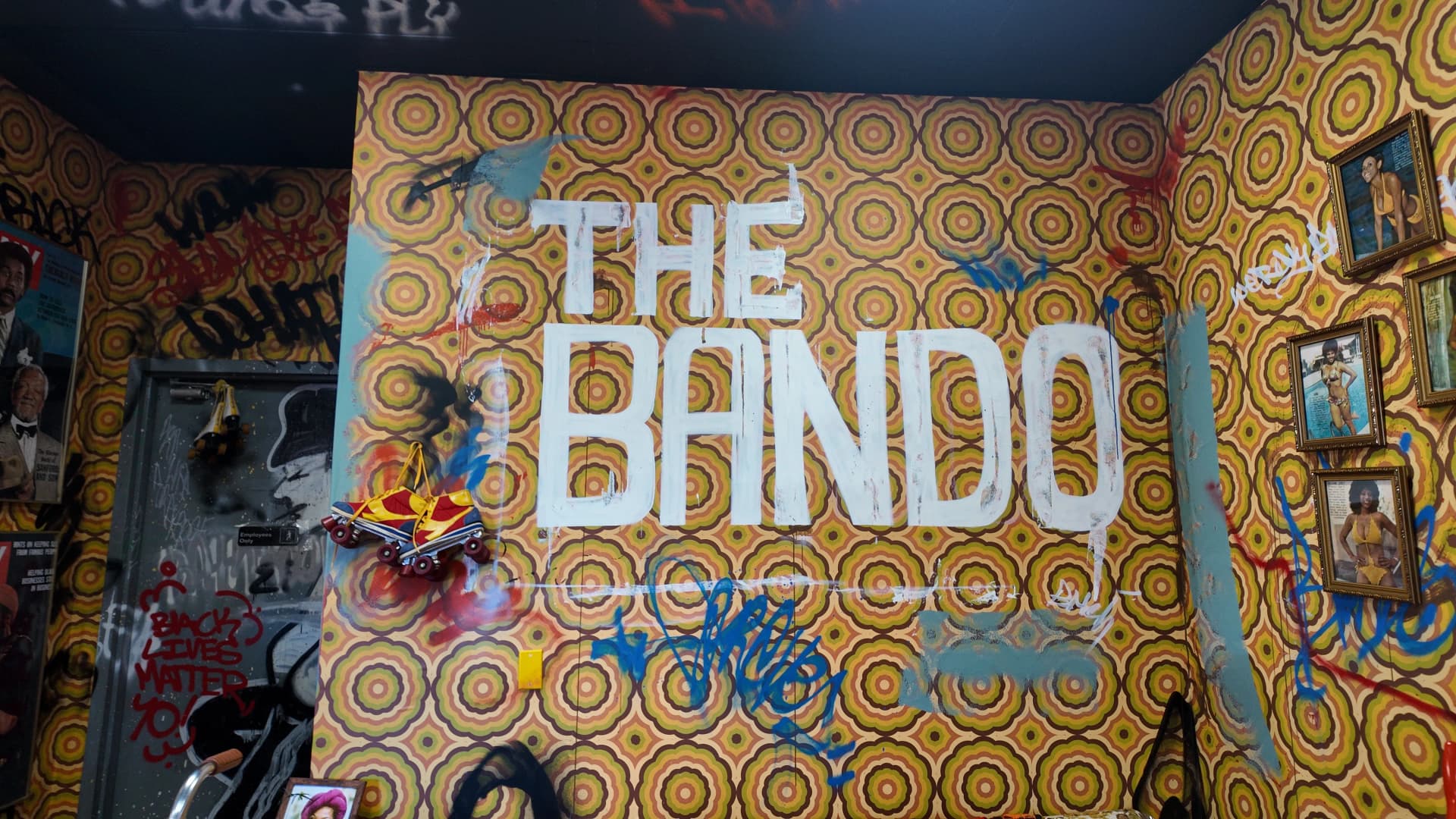
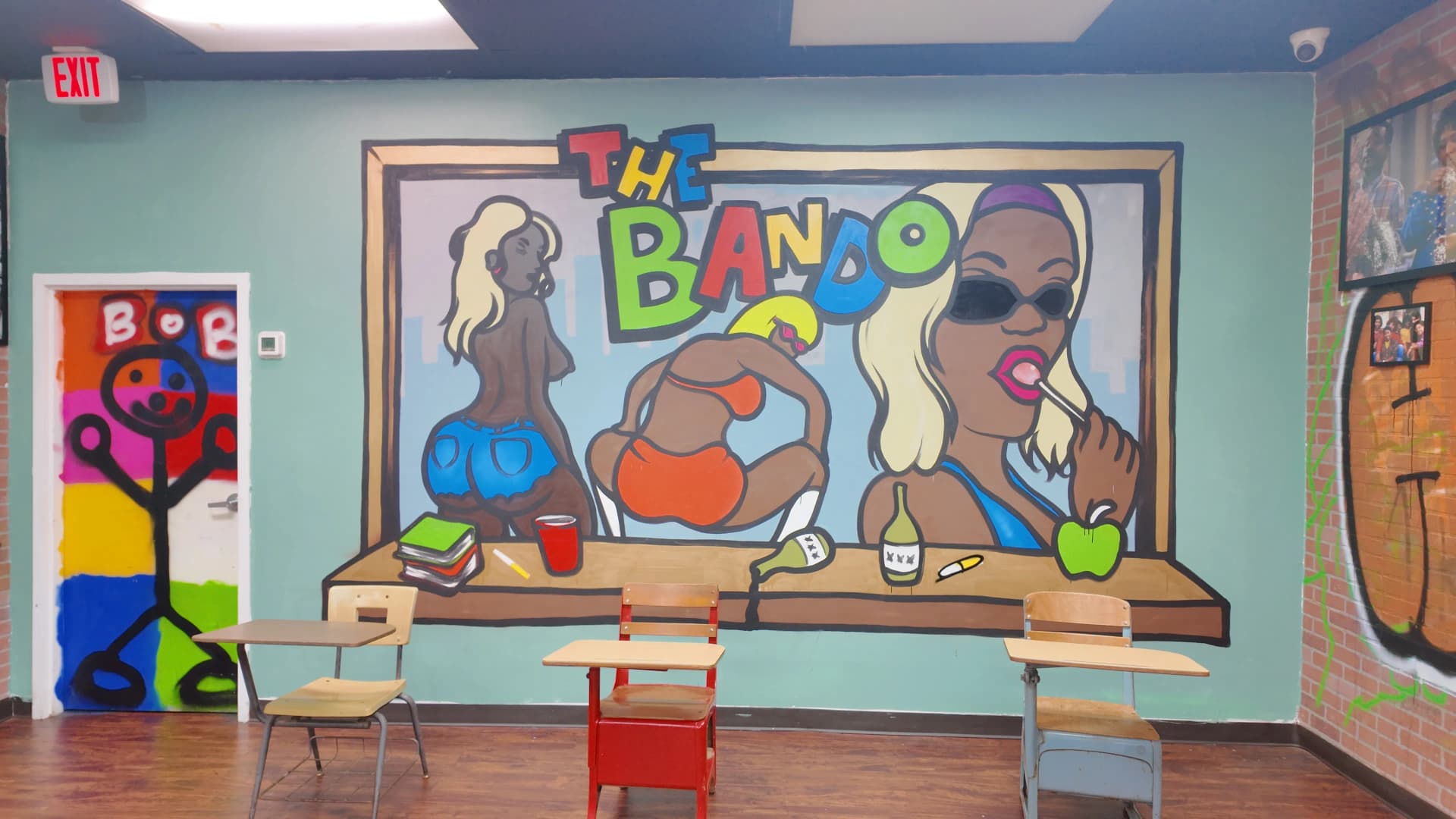
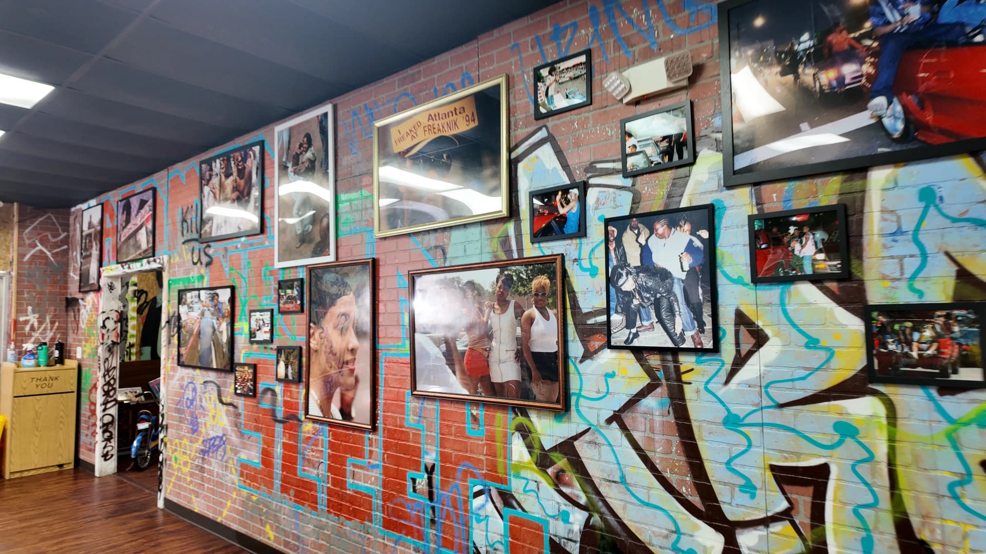
Terry and Darius built something Atlanta had never quite seen before. Walk into TheBando on the Westside and you are standing inside a Black history museum. Photographs on the walls, murals, culture you can feel. You are also standing inside a fried chicken restaurant, and the smell of the food tells you that just as fast.
That is the whole idea. Two things Atlanta does better than anywhere else, food and history, living under one roof. Neither one is a gimmick bolted onto the other. The history is real. The chicken is real. People who walk through the door leave talking about both.
“The food is real. The history is real. A brand that honors one and hides the other is only telling half the truth.”
A dual identity like this is a gift and a design problem at the same time. Say too little about the museum and you flatten it into just another wings spot. Say too little about the food and you lose the people who came hungry. The brand had to hold both, at full volume, without either one shouting over the other.
How the old site flattened the brand
The building said one thing. The old website said something smaller. All the culture that hit you in the room, the murals, the photographs, the sense that you had walked into a story, did not survive the trip to the screen. Online, TheBando read like a generic restaurant page. The museum was barely there. The food was hard to reach.
That is what a weak brand does. It takes something specific and makes it look like everything else. A visitor who had never been inside had no way to feel the two-in-one identity, so they had no reason to treat TheBando as anything special.
| Brand element | Old site | New brand |
|---|---|---|
| Identity | Reads as a generic restaurant | Museum and restaurant, both up front |
| The history | Buried, easy to miss | Given its own space and presence |
| The food | Hard to find and order | Effortless, front-door ordering |
| First impression | Flat and forgettable | Specific to TheBando in seconds |
| Mobile experience | Pinch, zoom, hunt | Fast, clear, culture-first |
When ROV started the TheBando brand and website work, this was the core question. Not how do we make the site prettier, but how do we make the screen finally tell the truth the building already tells.
The rebrand, step by step
Four moves. Culture first, then the food. See the full design breakdown on the TheBando case study page.
Honor the dual identity
We started from the premise that TheBando is genuinely both a museum and a restaurant, and refused to rank one above the other. The brand system was built to carry both truths at full strength, so a first-time visitor online feels the same two-in-one identity a walk-in feels in the room.
Give the museum and the menu equal space
The history got real presence instead of a buried footnote. The food got a clear path instead of a maze. We designed the layout so the cultural experience and the ordering experience each had proper room to breathe, and so exploring one naturally led into the other rather than competing with it.
A mobile-first brand experience
Most people meet an Atlanta restaurant on a phone first. In the car, on the Beltline, waiting at Five Points. The old site made mobile users pinch and zoom past the culture to find anything. We rebuilt the mobile experience so the brand lands instantly and the menu is one tap away, no hunting required.
Keep the culture central
We never pushed the Black history museum aside to make room for ordering. The redesign gave both sides of the business proper presentation, so visitors can learn the history, feel the culture, and order the No Cap without the brand ever feeling cluttered or confused about what it is.
The brand does its work in seconds
People decide how they feel about a brand almost instantly. Before they read a menu item, before they scroll, they get a gut read on whether a place feels real and worth their time. For a dual-identity spot like TheBando, that first read has to land both the culture and the food at once, or the whole idea collapses into just another chicken place.
is how long it takes a visitor to form a first impression of a website, according to research on visual appeal. That is faster than a blink. A brand that reads clearly in that window earns the next scroll. A flat one loses the visit before the food is even mentioned.
Source: Web usability research
The rebrand was built for that window. The moment someone lands, the identity is unmistakable: this is a museum, this is a restaurant, this is TheBando and nowhere else. The culture is not a slow reveal you have to earn. It is the first thing you feel, and the food is right there behind it.
How the brand held up
The clearest sign a brand is working is that people stay to explore it. TheBando's did.
You cannot measure culture directly, but you can measure whether people stick around for it. After the rebrand, the engagement numbers pointed the same direction: visitors were staying longer, bouncing less, and seeing more of the story.
Average session time landed at 4 minutes 38 seconds. Bounce rate dropped from 94 percent to 46 percent. Page views rose 33.5 percent. Those are not vanity numbers. They mean the brand invited people in and gave them a reason to keep looking, at the museum and at the menu both.
The ordering side of the story is even bigger, but that is a different lever. If you want the revenue-and-ordering breakdown, read the full revenue-and-ordering story here. This page is about the part that came first: getting the brand right.
What this means for Atlanta restaurants
Most Atlanta restaurants have more identity than their website shows. There is a story in the room, in the neighborhood, in the reason the place exists. Buckhead, the Westside, Old Fourth Ward, Summerhill. The character is there. It just gets flattened the moment it hits a generic template.
A real brand identity fixes that. It carries what makes you specific onto the screen so a stranger feels it in the first few seconds, the same way a regular feels it walking in. That is the work ROV Studios does on Atlanta restaurant brands: find the truth of the place and make the design tell it.
TheBando had the hardest version of this problem, two full identities to honor at once, and the brand held. A single-identity restaurant is a simpler job, and the payoff is the same: people who feel who you are before they ever taste the food.
The short version
TheBando is a Black history museum and a fried chicken restaurant in one building on Atlanta's Westside. The old site flattened that into a generic restaurant page. The rebrand honored both identities at once, gave the museum and the menu equal space, and kept the culture central. People stayed to explore it: 4 minutes 38 seconds average session, bounce rate down from 94 percent to 46 percent, page views up 33.5 percent. Get the brand right and people feel who you are before they read a word.
Related reading
Frequently asked
Ayush Basu
Founder & Creative Director, ROV Studios
Last updated March 30, 2026
Does your website tell the truth about your restaurant?
We run free audits for Atlanta restaurants. Tell us where to look and we'll show you where your identity is getting flattened.